
Brighter Consultancy
A series of print works for Brighter Consultancy, aiming to stand out from their sector by going bold and bright. Copy and design by yours truly.
Bare Productions approached me to develop a ‘modernisation’ of the iconic Kinky Boots logo. Aimed at the eclectic Edinburgh Fringe audiences, they wanted to explore two routes – one paying homage, the other taking new steps.
Client: Bare Productions
Services: Brand identity, print
Contract: Freelance
Year: 2022
During our initial consultation, the client supplied the original logo and expressed interest in a flat version. As a wildcard, they also provided Studio Moss’ Season 13 Drag Race promo – something bold, with a mix of modern typography and retro styling. With those two references, I got to work on the two different routes shown here.
For the ‘rework’, it was relatively simple: I redrew the logo and stacked it, removing drop-shadows and simplifying the glitter texture into vector form. For the ‘new route’, I changed the identity entirely. First, I developed a bold logo, with depth added through a pastel palette, cartoon-ish highlights and star motifs.
Whilst we were excited by the bold new route, ultimately we prioritised audience recognition through the 'rework' of the traditional logo.
In addition to providing the logo, the project also led to creating artwork for merchandise (i.e. hoodies, T-shirts) and social media content.
PORTFOLIO
A series of print works for Brighter Consultancy, aiming to stand out from their sector by going bold and bright. Copy and design by yours truly.
Helping a Scottish craft beer brand carve out a balanced social media identity through bold graphics and earthy image direction.
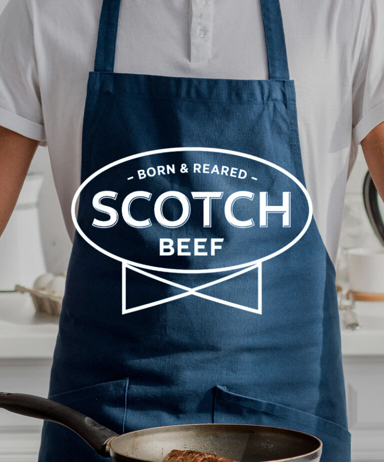
There’s an art to translating a solid brand identity across social media. Thankfully, that’s exactly what the brief called for from this next-gen investment company